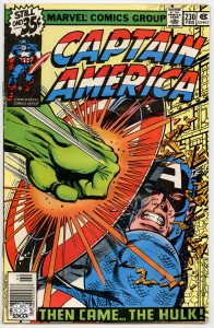
Talk about impact! You can feel your teeth rattle in this one.
According the the Marvel Wikia, the cover artists for Captain America #230 cover artists include Bob Layton and Ron Wilson with colors Nel Yomtov.
This particular cover makes the Favorite Covers collection because of the sheer visual simplicity that, quite literally, creates the impact. Consider the fact that we’re only seeing a suggestion of the Hulk, but we know immediately who it is based on the green skin color.
The artists and colorist show just enough to tell the the (potential) customer that we’ll be seeing this powerful character in a battle against the protagonist of the story. One fist and one pained expression tells you all you need to know, if you like this sort of thing.
Cover Breakdown

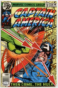
Let’s just break down a few elements of the cover. First, let’s look at how the eye tracks across this cover. The red arrows show how we look from the left to follow the fist of the Hulk. It’s coming from top down giving a visual cue that the Hulk is larger than Captain America.
The fist stops pretty effectively at the shield, but the eye continues to move to the right to see what the fist is striking. It’s interesting to note that Cap’s expression is one of pain and resistance. Considering his distance from the wall, the bricks shattering behind him, and the tight cropping here, you can see that Cap is stuck between the Hulk and a hard place. (Sorry for the poor jokes.)
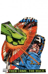
Photographers will tell you that a good crop is the difference between a good photo and a great one. Cropping out extraneous visual noise and focusing the eye on the subject will greatly enhance the image. Would this image have worked if the artists included more visual information in this cover? It’s debatable, but the power of this image comes partially from the claustrophobic framing of the image.
Back to the arrows, and we can see that after Captain America’s face, we have no place to go but to the bottom right corner. If you’re reading a comic, you know that the bottom right corner of a right-hand page is the cue for a page turn. On a cover, it’s the point where you decide if you’re going to buy this issue or not. In 1978, I made the purchase.
Guiding the Eye with Design and Color

Let’s just take one last look at the color because It matters to the storytelling here. Note how the main image is colored to match each character’s visual identity.
The green fist requires no additional information, as noted earlier. Cap’s color red-white-blue palette is simple, but the saturation is clear and bold.
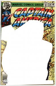
Here’s where it gets interesting with the color. The background is a pale yellow. If Cap was being slammed into a wall, it might make sense to include red bricks or gray cinder blocks.
Coloring this in red would have decreased the contrast of the primary image, so that definitely would not have worked. You can argue that gray would have worked, but it might have made the image look muddy and dull.

It’s worth noting that the colorist (Nel Yomtov is listed as interior colorist, so I may be incorrect in assuming he colored the cover) used just the right amount of yellow. Oversaturation or too much detail could have highlighted his coloring techniques, but it would have flattened the image. This level of saturation and detail brings out the image in the foreground, which is the story that they are telling to sell the comic.
Obviously the artists were aware of the logos that would cover the art. I checked online and couldn’t find the original art to Captain American #230, so if anyone out there has it, get in touch with me and I will update this post.
Inside the Issue
You may be wondering if the internal story by Roger McKenzie, Roger Stern, and Sal Buscema matched the powerful cover. Sadly, no. The cover sells a story that really doesn’t get pulled through in the actual pages. There’s a gratuitous face off between Captain America and the Hulk, but it barely resembles the promise on the cover. They got my 35 cents and the only reason this comic book is in my collection is because of the cover.
Be sure to check out my other Favorite Covers. Please leave a note in the comments if you want to see more cover deconstructions like this in the future.
Check out our guide to comic book page numbering.
Subscribe to the Comic Book School Newsletter
.

