In Part 1 of this series, we talked with Kate Willaert, a graphic designer for Fun.com, and Mark Bietz, VP of Marketing for Fun.com. They talked about how they utilized an infographic featuring the many costumes of Wolverine to drive people to their website. You should read Part 1: Snikt! Wolverine Infographic Claws Way to Successful Content Strategy first. (Go ahead, I’ll wait.)
Now, in Part 2, we get deeply involved with Kate’s creative process. This is an educational guide for those of you who want to design and distribute infographics of your own.
 BUDDY SCALERA: Let’s start with tools. What’s in your digital toolkit and how are you using these tools?
KATE WILLAERT: It’s all pretty standard: Adobe Suite and a Wacom. The infographics were mostly created and assembled in Photoshop, with a few elements created in Illustrator. Although Photoshop now contains vector tools, they’re still a little limited in some ways compared to the vector tools in Illustrator.
You had a pretty small space for text. How much writing and rewriting did you have to do to make all of this work?
Technically, I could have included as much text as I wanted — I’ve seen a few infographics that look like nicely-designed magazine spreads — but people seem to be more likely to read the text in a graphic if there’s less of it, and if it’s broken into smaller bite-sized digestible chunks.
I tried to limit each caption to roughly the size of two “tweets.” If you use Twitter, you probably know how challenging it can be sometimes to get your point across inside a character limit. Writing the captions was a similar challenge.
It looks like you have a single Wolverine pose and then you place the costume over that. It looks great, but it was probably a good deal of effort to make this work. Why did you chose this route versus pasting scans from actually comic book pages?
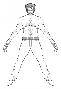
From a design standpoint, having each costume appear on a character in the same pose and in the same style makes it easier for viewers to pick up on differences quickly at a glance.
It’s also difficult to find scans from comics that show a full costume unobscured. In the research stage I frequently had to find multiple images of a particular costume in order to see the entire thing.
From a design perspective, how did you land on this specific layout?
I made the Iron Man infographic four columns wide because I was concerned it’d get too tall with any fewer costumes. However, after seeing it resized on various blogs and how small the figures became, I decided to go with three columns for Wolverine. As far as the general look and aesthetic, I was trying to emulate the feel of those stylish ink drawing movie posters for The Wolverine.
Clearly, as a character, Wolverine has a rich and visually striking history. How much of this did you know versus how much did you discover during research? And at any point, did you think to yourself, “what the hell did I get myself into”?
As a longtime X-Men reader, I knew most of the history going in. The research process mainly consisted of finding sources to confirm that I wasn’t misremembering anything, and to uncover any additional obscure trivia that I wasn’t aware of.
Tell me about some of the interesting ah-hah moments when you discovered something you didn’t know.
The part about Wolverine’s arms initially being hairless came as a particular surprise. It’s one of those things that seems so obvious now, and yet somehow I’d never noticed until it was pointed out on John Byrne’s FAQ.
Some of the most fascinating tidbits come from Byrne’s very candid FAQ (and forum), like the anecdote about being informed that Wolverine was getting his “real costume” back.
It seems like Wolverine was a popular character since he was first introduced in 1974 in Incredible Hulk #181. Why do you think this character has remained so popular for so long?
Actually, it might be a little surprising, but Wolverine wasn’t always a very popular character. Even more surprising, X-Men was originally cancelled due to low sales (and went into reruns!). It was later revived with a new team that included Wolverine, but it took some time for people to warm to the character. When an early story with this “All-New All-Different” X-Men called for one of the new members to die, the choice came down to Thunderbird…or Wolverine!
As for why he’s become so popular since then? I think it comes down to the “a touch of vinegar” principle. Vinegar is pretty harsh by itself, but it’s a mainstay of food recipes because adding just a little bit of harshness creates a dynamic that accentuates the flavor. Many fans of The Beatles suggest that the Lennon/McCartney combination worked so well because Lennon’s sensibilities added a little “vinegar” to the mix. Likewise, I imagine what makes Wolverine stand out is that he’s a hero who’s a little rough around the edges.
What kinds of things did you have to cut to fit the infographic?
Early on I decided to limit the infographic to only costumes he wore under the codename “Wolverine,” as purely a time concern more than anything. Fans wanted to see the Barry Windsor-Smith Weapon X, the Age Of Apocalypse Weapon X, Patch…but to include everything would’ve resulted in the chart doubling in length.
I also had to cut some trivia that I couldn’t find the space for, mostly related to the origin of his hair. I collected the most interesting “cutting room floor” bits in a blog entry on Tumblr.
 This infographic went viral and popped up in a variety of places. The Tumblr community really seems to like this particular graphic. How does it feel to see something you’ve created go viral and get such a positive response?
Oh, it’s fantastic! I love seeing all the different reactions people have to it.
Your design makes me want to create an infographic. How would a regular person get started on an infographic?
Well, the first step is figuring out a topic (or a unique angle on a topic) that hasn’t been done before. Once you have that, the next step is to research the topic further and flesh out what the infographic is going to say.
Then, hire a designer. 🙂
What are your top 3 tips for someone interested in creating an infographic?
It’s difficult to narrow it down to just three things, but I’d have to say:
1) Keep it visual. The purpose of an infographic is to present information quickly at a glance, so don’t let the text overwhelm the images. If it starts reading like a magazine article, it’d probably be more effective as a blog post instead.
2) Be specific. Narrowing the focus lets you to give the reader a deeper vertical slice of information that might blow people’s minds, whereas a buffet of general assorted facts only provides a surface overview.
3) Promote it. Having the most amazing infographic ever isn’t going to do you much good if nobody sees it.
What can we expect to see from you next?
KATE: Nothing I can talk about just yet, but keep checking our blogs at HalloweenCostumes.com and T-Shirts.com. There will be some new things happening soon.
MARK: Also, if any of your readers have suggestions, we’d love to hear them.
More Links:
- Kate’s Uncool Art Blog on Tumblr
- Buddy’s Marketing Blog – WordsPicturesWeb.com.


